Introducing the Troubleshooting Chart
June 11, 2014 by James WingWhen I'm troubleshooting a tough issue, I always draw a chart to analyze, structure, and communicate the incident. In this post, I will introduce the format of the Troubleshooting Chart and some of the fundamentals behind it.

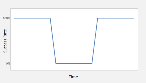
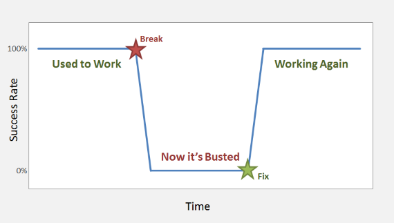
The chart shows success rate over time, and can be used to visualize an incident as a break in the otherwise continuous success rate. The chart is a useful visualization of the incident and a good communication tool for both technical and non-technical audiences. Most importantly, making the chart is a great activity, guiding you through a structured investigation of the incident.
The chart's troubleshooting magic comes from its axes -- success rate and time.
- Success Rate - Most system activity can be modeled as the success rate compared to the normal, expected performance. This might be the number of web pages successfully served, files processed, reports generated, orders taken, anything. What's important is analyzing what the system has accomplished, not just hoping for errors that tell you what to do. Customers don't really complain about errors, they complain about the absence of success, and they are depending on you to restore success rather than suppress errors.
- Time - Timeline analysis is the core of a troubleshooting effort. You can't really understand the root cause or have a truly reliable fix without understanding why the events transpired in the sequence they did. Critical events include when the incident was noticed, when it was reported, when it actually happened, when errors did or did not appear, and what happens in the aftermath of a fix. When you start troubleshooting, these events may seem contradictory or nonsensical. Before you are finished, you should have arrived at a consistent set of facts.
Annotating the chart with standard stages and events, we can see a standardized map of an incident timeline. You start your troubleshooting with the reported claim that something is now busted, although it may not yet be clear exactly what is broken or how severely.

Drawing this chart might seem like overkill. After all, charts don't fix broken systems, you will still need some code or infrastructure change to fix things, right? For a simple incident, it probably is unwarranted. Go ahead and check the error logs, maybe you'll get lucky and find an error that matches the reported incident at the expected time, and maybe the error information will tell you everything you need to know to make a fix. Why not reboot a server or two and see if things don't just get better?
But more severe incidents defy these simple solutions. On days when the customers are fuming over extended outages, when the reboot only made things better for a few minutes, when you still see error messages after the first fix, and when senior management start dropping by your desk to ask how everything is going, the Troubleshooting Chart might be just what you need to restore sanity.
In future posts, I will drill into the details of the Troubleshooting Chart:
- Structured Troubleshooting Process
- Success Rate vs. Error Rate
- Communicating with the Chart
- Data Gathering and Processing