Communicating with the Troubleshooting Chart
July 14, 2014 by James WingThis post is part of a continuing series about The Troubleshooting Chart, a data-driven approach to troubleshooting. In this installment, we'll look at how the chart helps communicate the impact and status of an issue. We'll see how it concisely communicates critical incident information, makes you look smart, and helps you work better in support of other troubleshooters.
Serious incidents are always accompanied by a massive increase in interest from people who barely spoke to you the day before. But suddenly, the CEO is stopping by your desk to "just check in" and tell you about the interesting phone calls he's been getting from concerned customers. This is not a good time to babble about how you are looking into it, might have some answers soon, but don't really have any clue about what's going on. Even when you really are clueless. Correction -- especially when you're clueless.
Troubleshooting Chart to the rescue! The first thing you should give to any such curious stakeholders is the chart:
Critical Incident Information
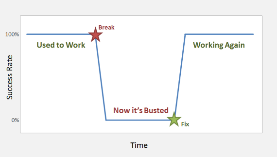
By showing success rate over time, the Troubleshooting Chart contains most of the critical information that business types want to know about an incident. Success rate directly describes business impact of an issue, at least for some process or feature, and it does so in customer-facing terms rather than technobabble.
The timeline helps everyone understand what happened, and when. This might not be deeply profound when an incident starts ("yes, we know it's broken now!"), but it becomes more useful as interim and permanent fixes are applied, and the resulting improvement is made clear. At the end of the incident, the missing area in the chart nicely demonstrates the total loss of functionality.
Looking Smart
Charts look technical, precise, and data-driven. If you just told your coworkers that you were aware of problems with order processing, they would not be impressed. If you said that order processing was working 80% of the time since the release yesterday, and that you were investigating the problems with the missing 20%, they might think you were on top of the issue. But when you show them a chart concisely illustrating these facts, they will be blown away by your awesome analytical powers.
Unfortunately, there is a real risk of overestimating the precision of the Troubleshooting Chart. Be careful about you or anyone reading the chart getting too hung up on 82.1% vs. 82.3% success. For most urgent troubleshooting, 80% is more than accurate enough to digest the message "mostly working, but with significant problems." Please emphasize the summary nature of the chart.
Improved Collaboration
One benefit of the Troubleshooting Chart is that by focusing on success rate, it can be created independently of the technical troubleshooting. This can be very helpful not only to divide and conquer an issue within your team, but also to work with other departments to resolve an issue. Continuing the example above, assume you observed that only 80% of orders are being processed correctly, and your initial investigation leads you to suspect a code issue within the responsibilities of a different department. Rather than just dumping the mess in their laps, you can use the Troubleshooting Chart to communicate what happened and when, and why this issue deserves their immediate attention. It's even more helpful for confirming that the issue has subsequently been fixed properly.
External partner or customer problems are an extension of the same scenario. I have experienced a number of issues where we had system data that clearly illustrated a problem, but it wasn't ours. It's not easy to tell a customer "the problem is you" but when you have to do it, bring The Troubleshooting Chart to help out. The timeline and impact data will be as invaluable to them as it is to you, and you don't have to act dumb and helpless (unless you choose to, of course).